Page 1 of 4
Potential Site Design
Posted: Sun Nov 11, 2012 10:43 pm
by Galnor
Crunch proposed this as a redesign of the website. Curious to see what people think about it:

Re: Potential Site Design
Posted: Sun Nov 11, 2012 10:45 pm
by Crunch
Two modifications:
1. A nice WoT themed graphic across the middle top
2. On the left column, a "What is KinslayerMUD" link
Re: Potential Site Design
Posted: Sun Nov 11, 2012 10:51 pm
by Galnor
Revision:

Re: Potential Site Design
Posted: Sun Nov 11, 2012 11:59 pm
by Kyrana
looks good
Re: Potential Site Design
Posted: Sun Nov 11, 2012 11:59 pm
by Kyrana
1 thing though... we get weave points, not turn points

Re: Potential Site Design
Posted: Mon Nov 12, 2012 12:09 am
by Chase
What's wrong with the current one? That just looks like a mud screen with bigger weird font.
Re: Potential Site Design
Posted: Mon Nov 12, 2012 12:44 am
by Crunch
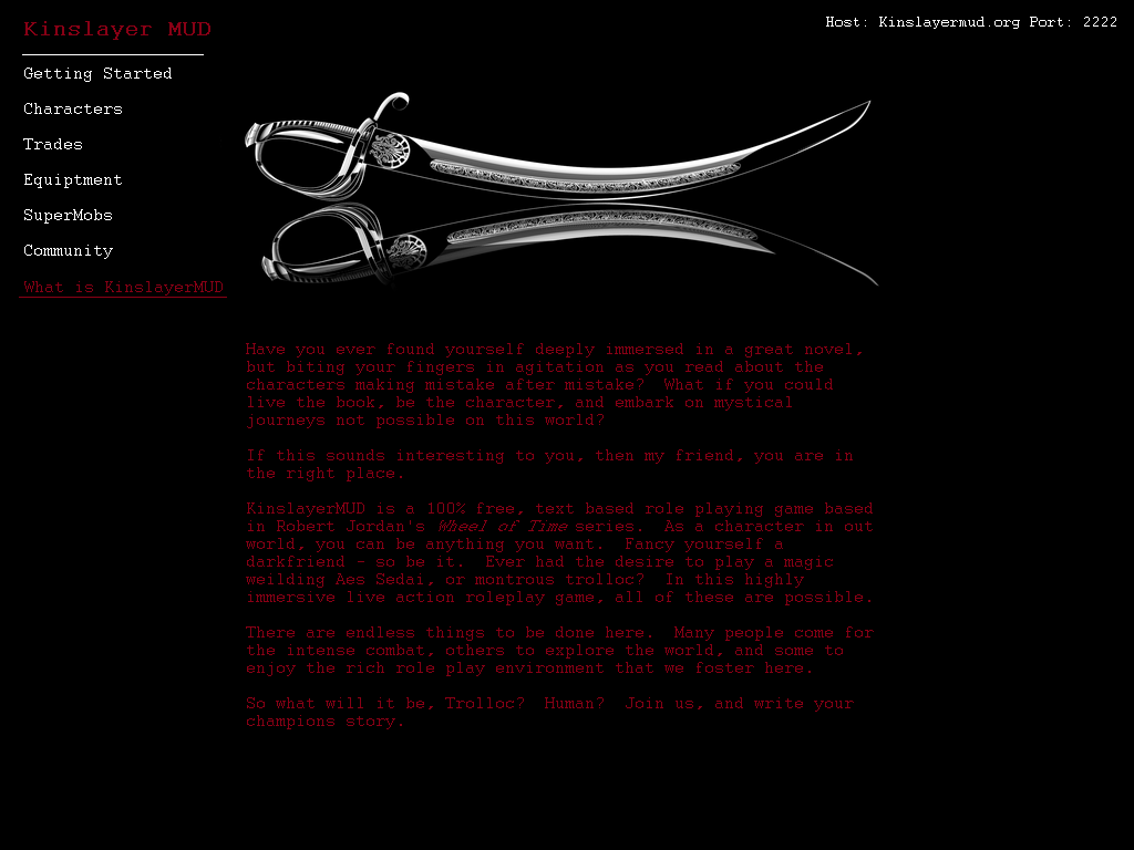
- kinslayermudWHATISKINSLAYERMUD.png (78.23 KiB) Viewed 80665 times
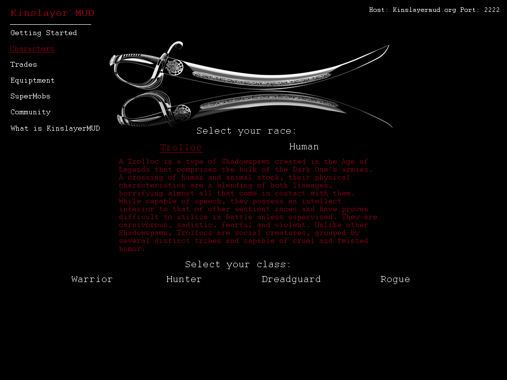
- kinslayermudCHARACTERS.png (84.71 KiB) Viewed 80665 times
Re: Potential Site Design
Posted: Mon Nov 12, 2012 12:46 am
by Bubonic
actually like it. but Bubonic is worth more than 3 wps.... come one at least make it 4.... Sheesh.
Re: Potential Site Design
Posted: Mon Nov 12, 2012 12:48 am
by Malaki
and phantasm killing harry LOL
Re: Potential Site Design
Posted: Mon Nov 12, 2012 12:50 am
by Tyson
Dat lookin' more badass.
Re: Potential Site Design
Posted: Mon Nov 12, 2012 12:52 am
by Crunch
The homepage needs a little more filler, some more crimson brought in too.
Sorry to offend you guys with the "battle reports" lol, if anything you should be kind of tickled that when I was trying to think of characters your names popped up =P
Re: Potential Site Design
Posted: Mon Nov 12, 2012 12:53 am
by Malaki
more just kidding with phantasm
Re: Potential Site Design
Posted: Mon Nov 12, 2012 12:55 am
by Kyrana
lol at you thinking of razhak over kyrana
Re: Potential Site Design
Posted: Mon Nov 12, 2012 1:00 am
by Malaki
it looks decent enough, i don't really see any reason to not change it to that
Re: Potential Site Design
Posted: Mon Nov 12, 2012 1:22 am
by Crunch
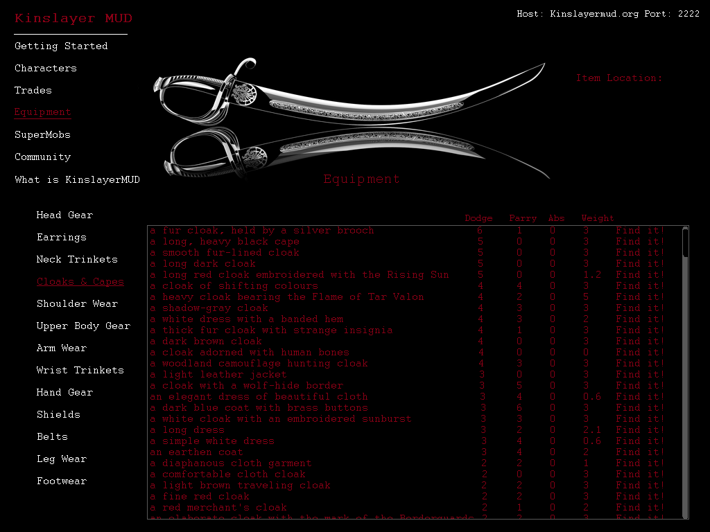
- kinslayermudEQUIPTMENT.png (98.54 KiB) Viewed 80633 times
Re: Potential Site Design
Posted: Mon Nov 12, 2012 1:23 am
by Malaki
if that's how it's going to go in then take that t out of equiptment to make it equipment!
Re: Potential Site Design
Posted: Mon Nov 12, 2012 1:26 am
by Crunch
I just learned how to read last week... also, I was up drinking all night and am running on no sleep. But yeah, just bare with me on the typos.
Re: Potential Site Design
Posted: Mon Nov 12, 2012 1:28 am
by Galnor
For the most recent page I would change the item name to a URL and get rid of the "Find it!" I always hated that. I am thinking we can have a separate page for each individual item. It was how I was planning to do it originally. That page would have all the stats for the item that we'd make public.
Re: Potential Site Design
Posted: Mon Nov 12, 2012 1:29 am
by Galnor
Also it would be really cool if we had breadcrumbs for that.
So there'd be the Equipment page. Then each category would have breadcrumbs of "Equipment -> <Category Name>" then each item would have breadcrumbs of "Equipment -> <Category Name> -> <Item Name>"
Could be tricky if an item can be worn in multiple places however.
Re: Potential Site Design
Posted: Mon Nov 12, 2012 1:30 am
by Crunch
Hmmm. Yeah, or just have an info box pop up over the current page with detailed stats.
Functionality sucks when you have to back page after looking at details for each item.
Re: Potential Site Design
Posted: Mon Nov 12, 2012 1:32 am
by Galnor
yeah that could potentially work as well, though the main reason I was thinking we could have an item page is because for SMOB listings I was going to have the item list link to the item page as well.
Re: Potential Site Design
Posted: Mon Nov 12, 2012 1:33 am
by Crunch
breadcrumbs would work, just gotta keep functionality as priority one.
Re: Potential Site Design
Posted: Mon Nov 12, 2012 1:34 am
by Crunch
Really I'm just trying to help you find a design that you can play with and alter on your own. Something like this can be made to look very nice and function well with minimal design skills.
Re: Potential Site Design
Posted: Mon Nov 12, 2012 1:37 am
by Malaki
i'm with crunch, functionality is most important. going to a new page for each piece of gear is annoying and stupid
Re: Potential Site Design
Posted: Mon Nov 12, 2012 1:38 am
by Galnor
If you limit it to that box, then we would also need the same box in the SMOB page, player equipment page(which I am planning to add), and any other page that will link to an item. That is a limitation & a hindrance to functionality. There is no reason we can't display the most important stats on this page and have another page that has the full details of the item.
It is really no different than searching for products on Amazon. They have a search results page with a summary per product. Then they have a full product details page.