Page 2 of 4
Re: Potential Site Design
Posted: Mon Nov 12, 2012 12:31 pm
by Semper
Also, "Enter the Battle" !!! is not my choice phrase

Re: Potential Site Design
Posted: Mon Nov 12, 2012 12:44 pm
by Crunch
Have to agree with you on that, the homepage needs to be made a little more attractive, but I'm pretty good at that kind of stuff. The functionality aspects are what's in question here, I'll take care of the aesthetics no problem =P
Re: Potential Site Design
Posted: Mon Nov 12, 2012 12:45 pm
by Crunch
which means, I'm working on some kinslayermud logo proposals, and possibly a one or two more well placed graphics on the homepage.
Re: Potential Site Design
Posted: Mon Nov 12, 2012 2:24 pm
by Evilina
That's an awesome site design, I agree let's limit web pages, for years it took three pages to get to weapon listings if you didn't have it bookmarked.
Re: Potential Site Design
Posted: Mon Nov 12, 2012 4:06 pm
by Crunch
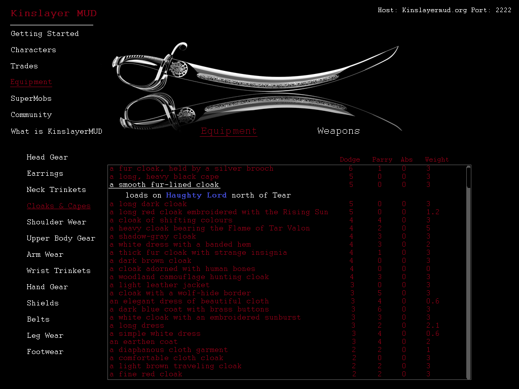
- kinslayermudEQUIPTMENT.png (95.25 KiB) Viewed 110277 times
Re: Potential Site Design
Posted: Mon Nov 12, 2012 4:07 pm
by Malaki
would the haughty lord part show up if you clicked on it? or is that going to display underneath all items?
Re: Potential Site Design
Posted: Mon Nov 12, 2012 4:13 pm
by Evilina
How about a scroll over to make that appear?
Re: Potential Site Design
Posted: Mon Nov 12, 2012 4:15 pm
by Crunch
I imagine that would be the result of clicking the item on the list, then the blue haughty lord would be a link to the smob page of the Haughty Lord
Re: Potential Site Design
Posted: Mon Nov 12, 2012 4:15 pm
by Malaki
sounds like a good setup
Re: Potential Site Design
Posted: Mon Nov 12, 2012 4:19 pm
by Crunch
The scroll over stuff, like on facebook where a little box pops up when you hover over a persons profile name, is pretty hard to set up from what I've gathered, and doesn't work super well in high density like our equiptment list, so either breadcrumbs like galnor suggested, or a tree list (as I demonstrated) would make the most sense.
The breadcrumb stuff for html5 is really good though, so that's definitely worth consideration.
The only fallback to breadcrumb might be not being able to see everything stacked side by side for fast comparison, we'd have to actually go through and logically order everything from best to worst for ease of use to people unfamiliar with our eq.
Re: Potential Site Design
Posted: Mon Nov 12, 2012 4:40 pm
by Crunch
One cool idea for the Smob listings might be to have each smob have is own page as Galnor said, and then we can go through and screen capture zones with the smobs, and mark the location of the smob, and display that image on the smob page. Making it very easy for people to find smobs.
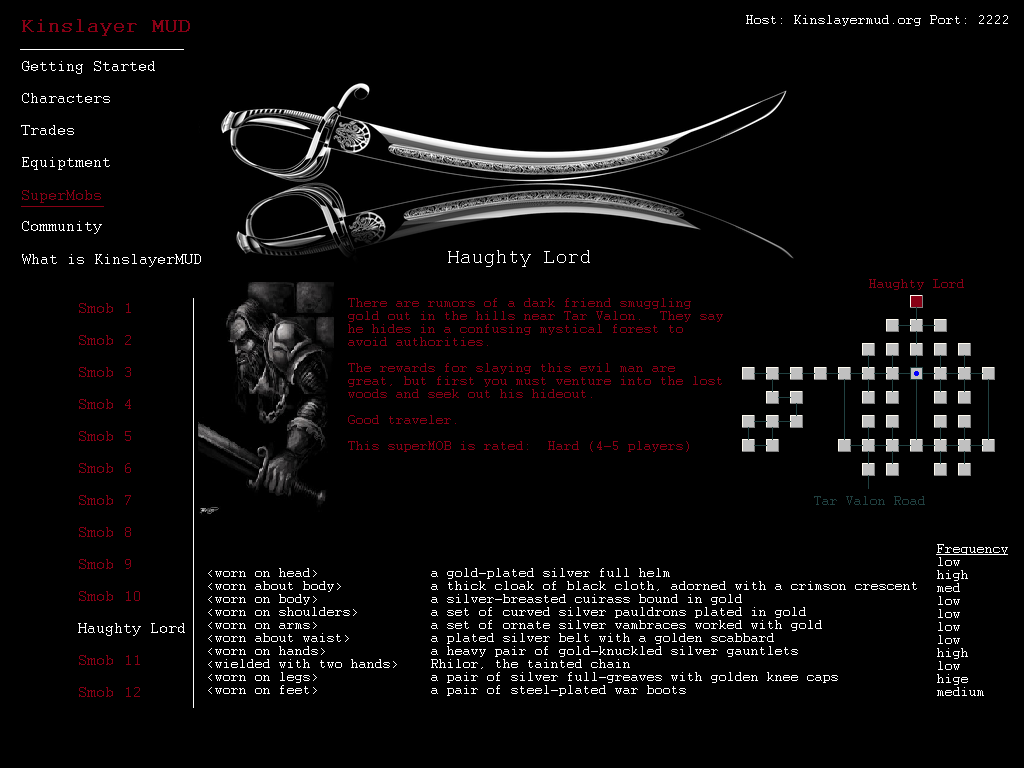
- kinslayermudSMOB.png (127.69 KiB) Viewed 110266 times
Re: Potential Site Design
Posted: Mon Nov 12, 2012 4:43 pm
by Crunch
^this page would be the one where you would want mouse-over item stats btw
Re: Potential Site Design
Posted: Mon Nov 12, 2012 4:48 pm
by Malaki
looks pretty good. how are we going to make it to where you get from point A (that being you see a weapon/item you want) to point B (that being what smob it loads on). Just a smiple click of the item takes you to which smob(s) loads it?
Re: Potential Site Design
Posted: Mon Nov 12, 2012 4:51 pm
by Crunch
yeah, so if you click the item in the items listing, it drops down a tree item below it showing which smob it loads on, then clicking the blue "haughty lord" would take you to the smob's page
Re: Potential Site Design
Posted: Mon Nov 12, 2012 4:52 pm
by Malaki
sounds pretty simple. simple is good!
Re: Potential Site Design
Posted: Mon Nov 12, 2012 5:45 pm
by Nyoga
fkn cool dood
Re: Potential Site Design
Posted: Mon Nov 12, 2012 6:00 pm
by Evilina
damn that's a nice layout, thanks for doing this Crunch.
I for one use the website almost daily.
Re: Potential Site Design
Posted: Mon Nov 12, 2012 7:21 pm
by Galnor
Going to begin working on the homepage layout.
Re: Potential Site Design
Posted: Mon Nov 12, 2012 8:04 pm
by Crunch
Give me to the go ahead, and I'll work with Verna to give you maps, pics, and backstories to populate the smob pages.
Re: Potential Site Design
Posted: Mon Nov 12, 2012 8:06 pm
by Galnor
That would be awesome!
Re: Potential Site Design
Posted: Tue Nov 13, 2012 12:10 am
by Galnor
Here is as close as I could get to Crunch's design for the home page. Let me know what you guys think:
http://www.kinslayermud.org/CrunchLayout.html
I coded it so that it should resize on smaller screens hopefully.
Re: Potential Site Design
Posted: Tue Nov 13, 2012 12:15 am
by Crunch
the top left kinslayermud logo is 2 pts higher than the menu items below it it my image
Re: Potential Site Design
Posted: Tue Nov 13, 2012 12:17 am
by Crunch
Try a crimson mouseover on the play now, rather than the bright red
Re: Potential Site Design
Posted: Tue Nov 13, 2012 12:18 am
by Malaki
Crunch wrote:Try a crimson mouseover on the play now, rather than the bright red
Re: Potential Site Design
Posted: Tue Nov 13, 2012 12:24 am
by Galnor
Updated the hover. You'll need to hard refresh. Not sure what you mean about the logo text. Mine is five points larger than the menu items below. Is that not large enough?